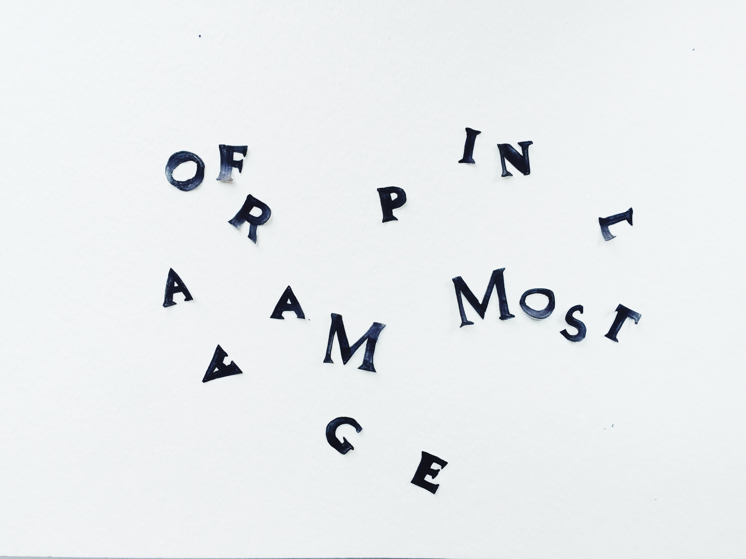
a long list of lessons from typography class
Sometimes I look back on the classes I took in college with world-renowned professors and wonder: Wow. What did I learn? (And where did I put my diploma??? I can’t find it.) I have either forgotten everything, or it’s imprinted in my brain in a way that I can’t access at this stage in my life.
But it’s radically different when you take classes as a working professional. This past spring, I took a Typography class at SVA with Jason Heuer, who was previously an art director at Simon and Schuster. I must have finally recovered from the depleting experience that was college, cause I took notes like a madmen, and felt hungry enough to absorb all the knowledge and actually put it into practice.
In this post, I’ve gone through my scribbles to synthesize everything I learned from the class. The vast majority of these words of wisdom are from Jason Heuer. Thank you, Jason.
I divided it up into a few sections:
Part 1:
The Creative Process Demystified
First, watch this. It's a type-based video that Jason played to bookend the class. I feel like I need a dose of this once a week, like a supplement I keep in my creative medicine cabinet.
Now, onto those class notes...
01. Prep work beforehand is integral to the process.
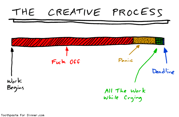
This chart summarizes my life in college, and taking design classes with weekly deadlines reminded me of those feelings of fuck off and panic and crying. What Jason impressed upon us is that the prep work is crucial.
There is so much prep you could be doing during the fuck off phase of the creative process. Starting with researching images, making mood-boards, finding relevant themes, seeing what other people have done, then brainstorming using word lists, word branches, and visual mood-boards. When brainstorming concept ideas, try to limit yourself to 15 minutes. If you feel stuck, move; do research, go for a walk, don't just sit there cause you’ll get paralyzed. Another thing: always start with B&W, not color.
When you have a few ideas you want to run with, you set up your workspace. As in: set up your template in Photoshop or InDesign, set bad type and bad imagery. Just throw it together for now - this will reduce the inertia for picking it back up later.
02. Perfect emerges from a series of iterations.
You’re going to have to do bad design in order to do better design. There is no shortcut. The secret is just doing the work, as in, amassing a collection of different versions of the same thing. Start with one design at a time, and work out the composition and details. Refine it step by step, explore different possible directions it could go, then take a step back and see what's working best.
You WILL get tired of the assignment, so see how you can find the spark again. Part of the trick is doing something that's excited you from the beginning.
“Don’t say, “should I do X or Y?” Do both, and see how they look. ”
03. How to develop "an eye."
You develop an eye by using it. Rigorously. As in, look at other people's work, work that you admire or work that you dislike, and ask yourself: what are they doing? What are the specific qualities that make this work stellar, or loathsome? Why doesn't my design look as good as that one? How did they make this look organic and designed at the same time? What is given the most emphasis and weight in the design?
You also develop "an eye" by building your own design bubble - collecting your sources of inspiration, and curating a feed. Then, you can start to build outside the bubble.
(I'm fascinated by this "eye" thing. What if an eye was something you could took the time to nurture, the way you'd nurture a godchild who was entrusted into your care?).
04. Everything can inspire. Notice what you notice.
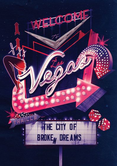
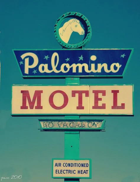
Designers find inspiration everywhere; from just being alive and present in the tangible world, to sifting back in time to visually rich, historical sources. One project brought up the concept of gambling, and subsequently, Las Vegas. Right there, Jason pointed out, is a world of visual texture and intrigue. Check out this Vegas signage and typography - don't you feel your creative senses tingling already?

05. Continually add tools and skills to your toolbox.
You can get good at something specific - a particular style or technique - that will differentiate you from the crowd. At the same time, you can be continually on the lookout for new tools to add to the toolbox. For instance, now I know (after taking Jason's class) that xeroxing can help achieve a naturally vintage look, in a way that feels far more natural than using Photoshop textures. Now I'm keeping a running list of skills and techniques I want to add to my toolkit: from minimalist design and Japanese printmaking to gothic hand-lettering and vintage packaging design.
"For a designer to be a triple threat," Jason said, "You have to get good at 3 things: illustration, design, and photography."
““Talent transcends all mediums. if you don’t know how to do something, just constantly look at what other people do with it.””
06. Do not sell yourself short.
Not selling yourself short means expending more time and effort than anyone else in order to make truly amazing work. The difference between professional work versus student work shows in the effort in the substantiveness of the concept and the quality of execution. Don’t do the easiest, cheapest option. Don't buy plastic folders to store your portfolio images, and expect to sell it to a client. Instead, ask yourself: what extra love can you give to this project?
Jason had this concept of "designer chess." If you look at a piece of great design, you'll see that they played a lot of complex moves in order to arrive there. It's not (usually) something anyone off the street can easily replicate.
Part 2:
Design is About Connection.
Here's another video we watched in class. James Victore is such a badass. I'd highly recommend his Design Matters interview with Debbie Millman.
01. The question is: what makes you want to keep looking?
We spent a good amount of time in class talking about "the hook," a concept I generally dislike, because it feels sales-y. But really, the question is: what makes this piece of design draw people in? To have great design, style isn't enough. Even minimalism, Jason said, has a philosophy to it - without an underlying concept, it's not minimalist, it's just simple.
Style + concept = Story
But what does "engaging" mean? Jason suggested that clever parts of good design ask people to figure something out, like a puzzle, thus making them feel smart. Another way to think about it (and this I prefer) is considering this: how do you make this design emotionally charged? How do you use a visual image to connect to another person's heart, soul, and life experiences? That seems to be what art is all about, and what I aspire to not just in design, but also in writing and illustration.
““Good design leads with the mystery, not with the answer.” ”
02. Creating visual interest and rhythm
We talked about creating tension in design through visual contrast. As in, playing with texture, hierarchy, rhythm, and pacing. Varying size and shape (mixing big, loud, busy, crazy with small). An example of something a classmate brought in:
03. What can you communicate in 2 seconds?
My natural tendency is to be too subtle in my art. But when it comes to visual communication, I've learned to simplify my concepts to something that people can understand right away, rather than needing to understand me, my backstory, or any other narratives I have floating in my head.
In that moment their eyes meet the design, the backstory doesn't matter. Instead, show them what is really there on the page.
04. Using a physical portfolio to engage clients
Jason was very convincing in the value of having a physical portfolio. When at meetings with clients, it's something tangible that you can use to connect with them. It's something they can hold in their hands and flip through.
Two rules of thumb from Jason:
Put the 2nd strongest piece to start, and strongest piece at the end.
When you don’t have a lot of work, make it more precious. Use big pages and lots of white space.
““Design that has energy is something that makes you stop.””
Part 3:
Typography in just 5 or 10 rules
Okay, this section is just for designers and typography aficionados. But I had to write it down, because I think he does a fantastic job of simplifying the rules, and making typography feel less daunting.
01. The 5 things essential parts of typography:
Kerning - spacing between individual characters
Tracking - spacing between groups of letters
Leading - distance between lines of text
Color
Composition
02. The ten rules of typography:
Kerning - make it look unified
Leading - (approximate suggestion: use 10/14, or add 4 to the pt size)
Tracking - (approximate suggestion: do +/- 30 for lower case, +/- 30-200 for uppercase)
Hyphenation - beware of ladders
Justification - beware of widows, orphans, and rivers. You need to adjust one line at a time.
Know type categories
Don’t use novelty fonts or anything expressive
Don’t look for type to be the answer, you’re the answer.
Work off the computer, don’t let it set your type
You’re always in control. if you’re feeling out of control, it’s bad type.
03. Stick to the grid or purposefully break it.
Does that sound kind of philosophical? As a rule of thumb, line up your design elements to grids, or purposefully break the grid. In other words, make it precise and not haphazard.
04. More breathing room in your design...
...is always better.
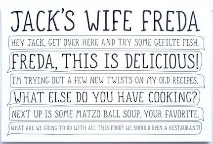
05. Don’t put boxes around text.
Jason's take is that boxes around text suggest you’re feeling out of control of the design, and that the design can’t stand by itself. I was totally guilty of this.
Part 4:
Realizing that I'm a control freak
One side effect of taking design classes (but really, just doing a massive amount of work and talking about it with others) to starting to better understand myself as an artist: my taste, my aesthetic sensibility, my philosophy of design, my vision for what I want my work to do.
Letting go of control is sometimes good for me.
What I realized is that I have this perfectionist urge to make things very beautiful and orderly. It is, essentially, about a need for control. Staying in control of my environment, my art, and my forms of self-expression. But I think, if anything, it's a reflection of an interior world that often feels like a jungle mid-thunderstorm.
I say I like "trying new things," but perhaps I don't. When Jason gave us certain exercises, I felt very resistant. One exercise was to "fuck up" a piece of paper with the word "HANDGLOVE" typed on it in all-caps, and see how we change the way the type looked on the page. People do crazy things with it, I presume. Stuff like sweating on it and putting it in their fridge to collect fridge drippings. (Ew).
Anyway, one thing Jason said that really stuck with me is how design is a balance between control, chaos, and energy. Taking his class forced me to think about what sorts of things I felt massive resistance towards - and why that was the case. It's encouraged me to push my boundaries and step into things that make me uncomfortable; whether it's a certain shade of loud orange, or a way of designing and seeing the world that isn't so intuitive to me, and at the very least, learn from it.
“Design is finding a balance between control and chaos/energy.”
Thank you, Jason. Now that I've written all of this down (and posted it on the internet), I can't forget it.