Inspiration log: a Parisian illustration studio, Alvin Ailey, documentation of grief, and color theory
Inspiration Log is my weekly collection of 5 things that's touched me creatively
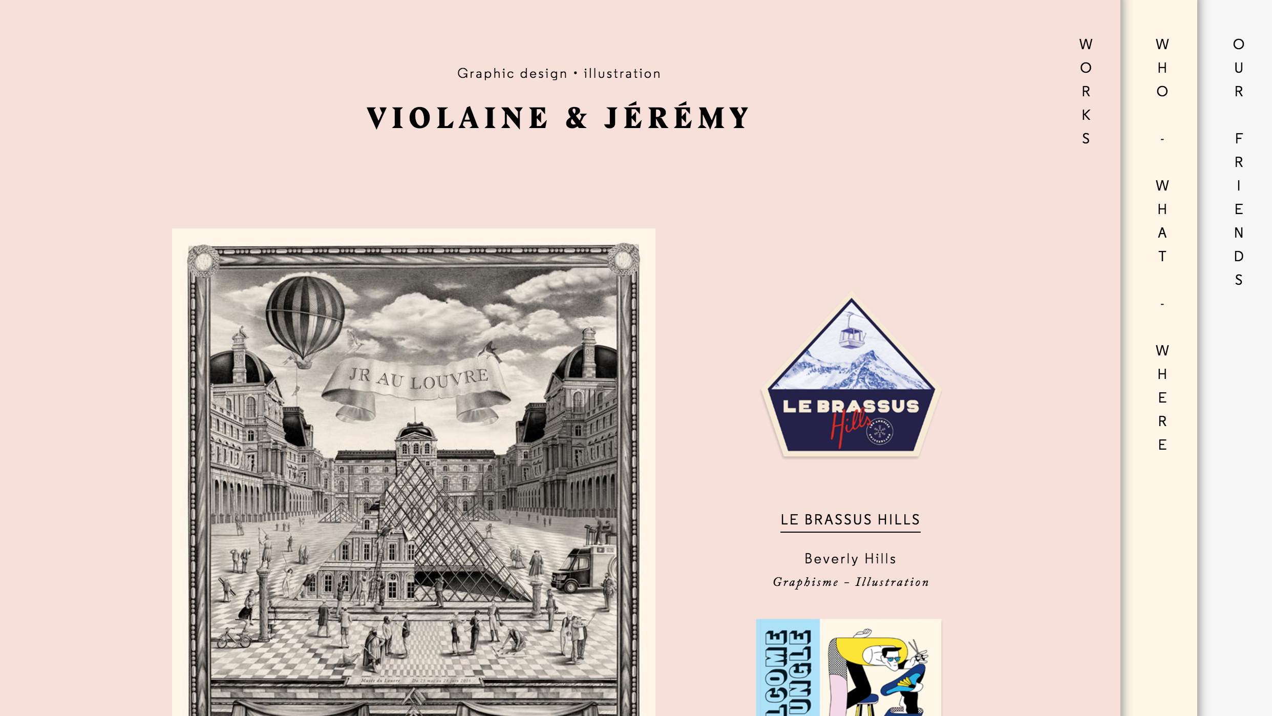
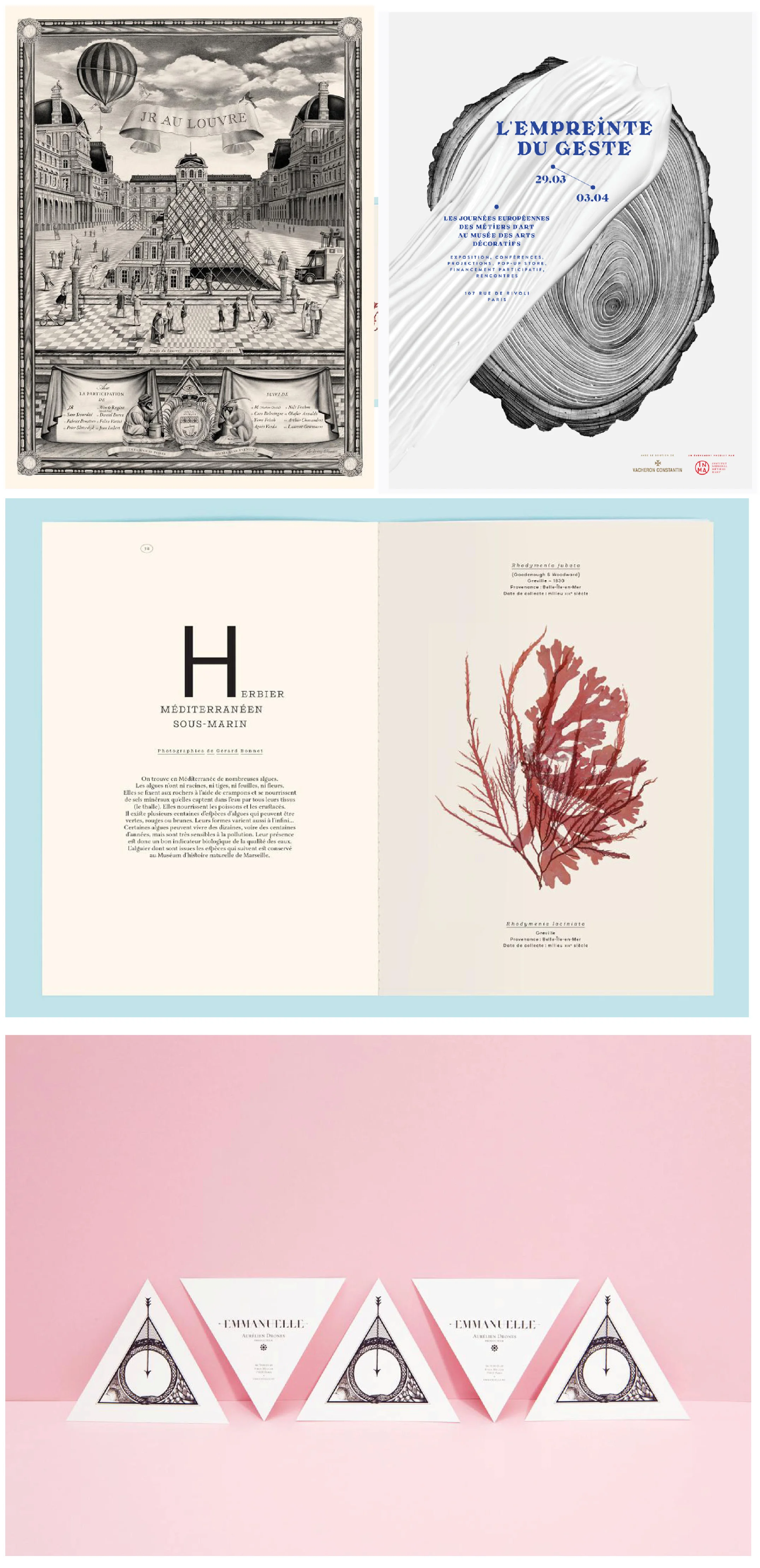
1) Violaine & Jeremy - a Parisian illustration & graphic arts studio
One of my coaching clients introduced me to Violaine & Jeremy as one of her biggest design studio inspirations. I really loved their style and was struck by how they've carved such a distinct niche for themselves: a blend of hyperrealistic/surrealist pencil illustrations with vintage-inspired typography, balanced with clean, modern graphic elements. Then there's that flair of Parisian sophistication:
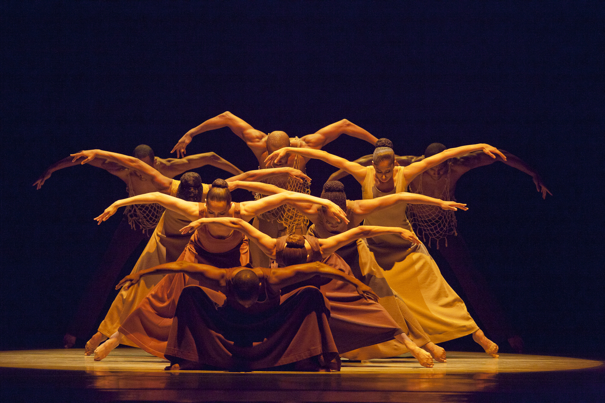
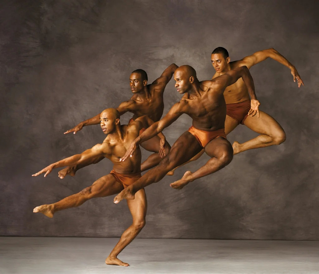
2) Seeing Alvin Ailey perform at Lincoln Center
To be honest, I don't frequent modern dance performances much because it often feels inaccessible and opaque. But I always love seeing Alvin Ailey. Their dancing is so soulful, powerful, and tangible in its expression of emotion. My favorite performance by them is this piece called Exodus, which blends hip-hop, house-dance, and their iconic modern dance.
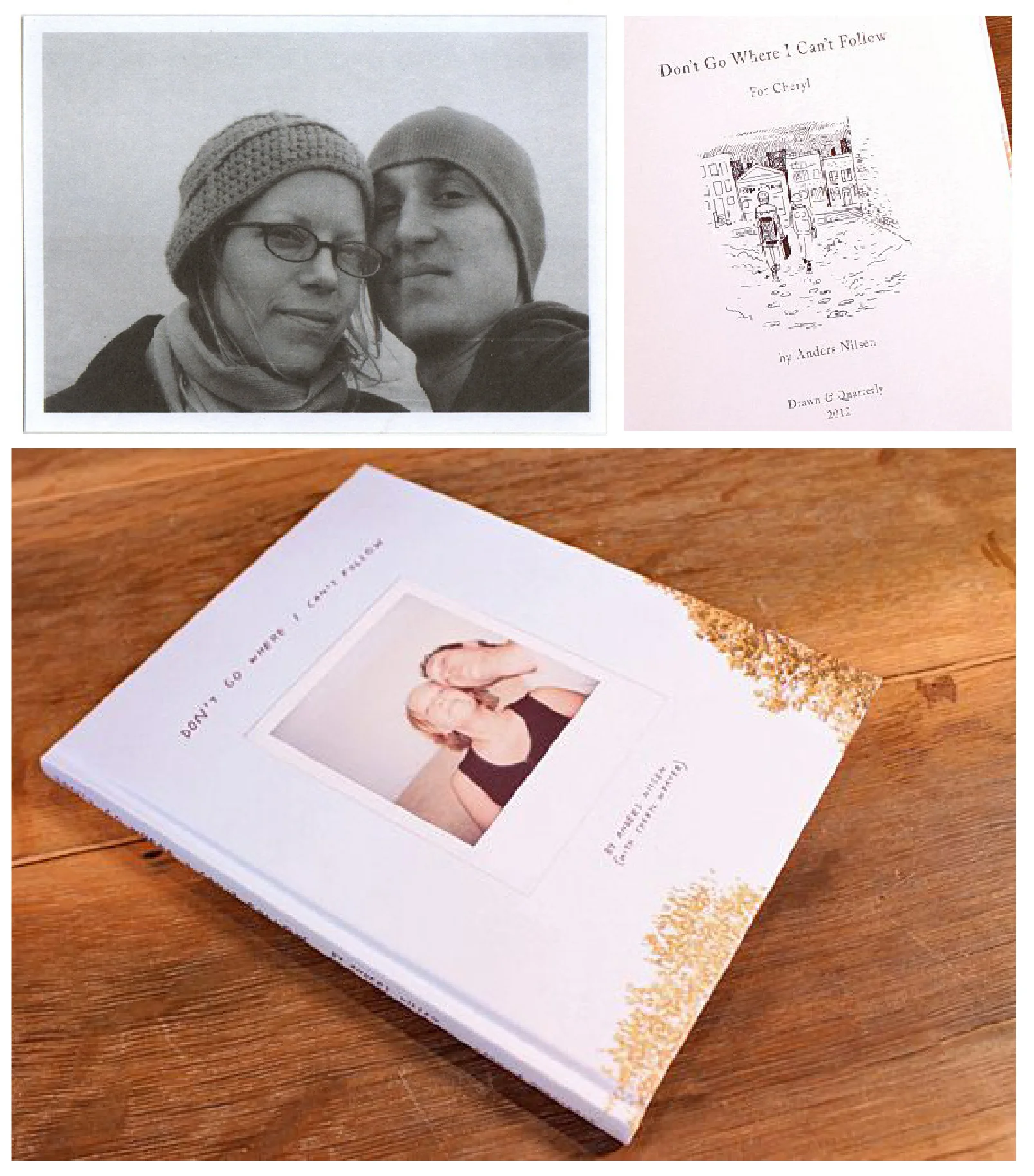
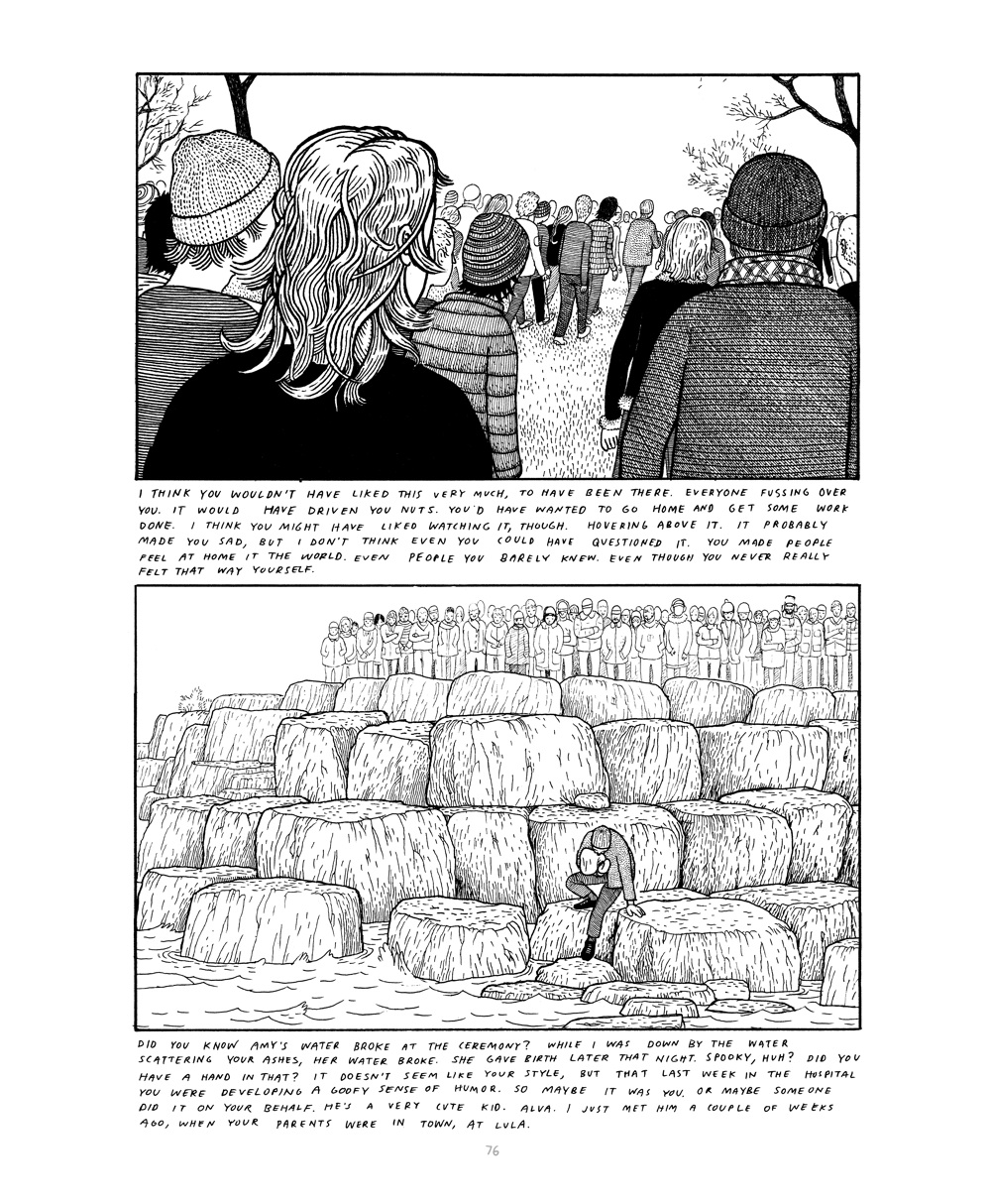
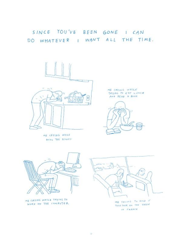
3) Anders Nilson's drawings of grief, two books: Don't Go Where I Can't Follow and The End
I first read about Anders Nilson's books in a Guardian article, three years ago-- about the death of his fiancé Cheryl, and its aftermath-- and even now I keep thinking back to it. It left such a deep impression on me. It was about using art to cope.
The books were originally intended to be distributed only amongst his friends and family, but the publisher convinced him that it had a wider audience. How hard it must be to put on public display your personal process of grieving and loss, but at the same time, what a gift of human intimacy, and stark emotional truth.
See also: interviews with Anders Nilsons in It's Nice That, TCJ
3) This color theory workshop I took at SVA.
I took a workshop this past weekend with Richard Mehl at The School of Visual Arts. It was exhausting, but wonderful. I don't think I've ever stared that hard at colors, and hopefully, it will bring me so much more "color awareness" in my own art and design practice.
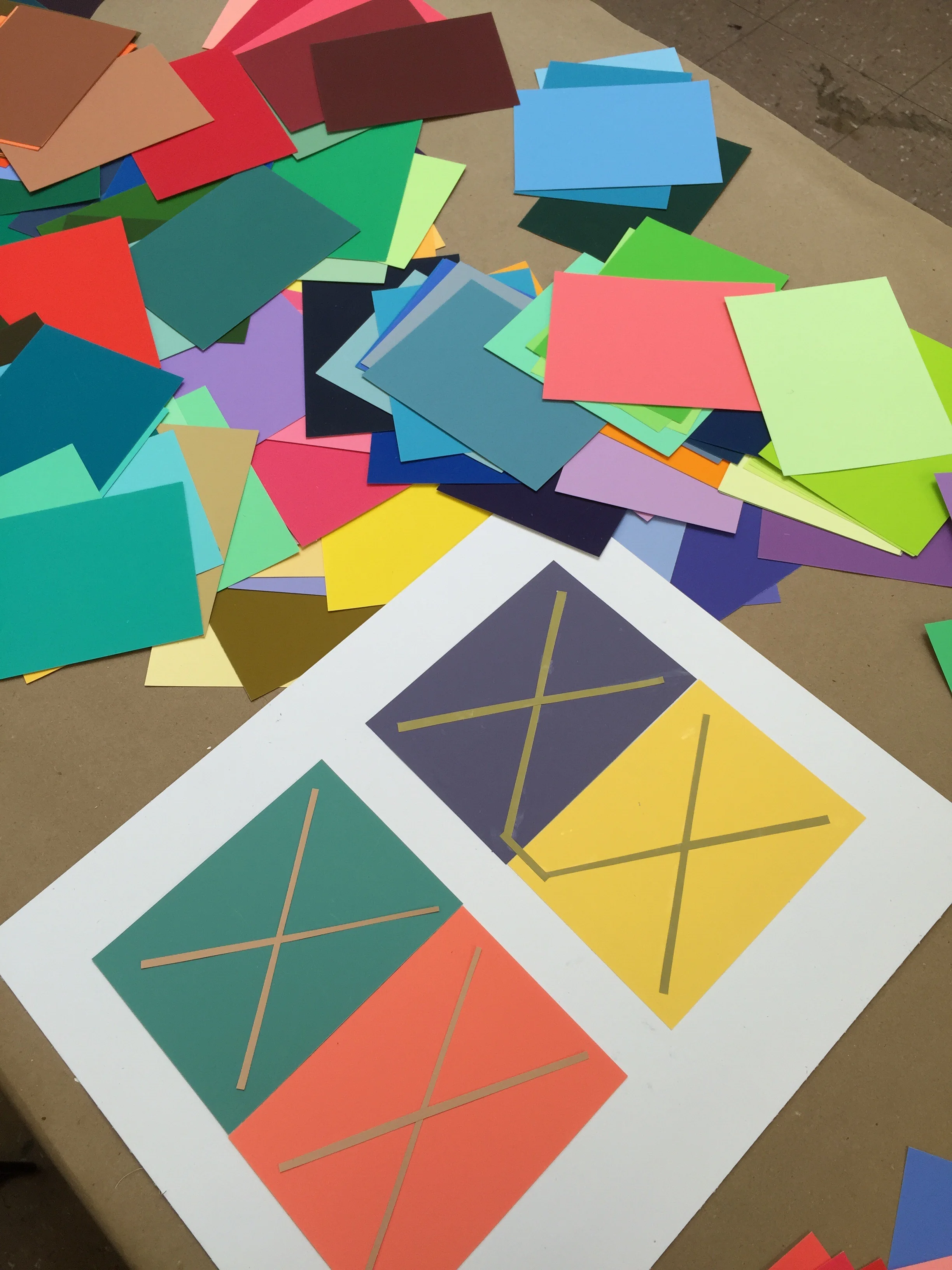
The x's here are from the same color paper, but look drastically different when on different ground colors.
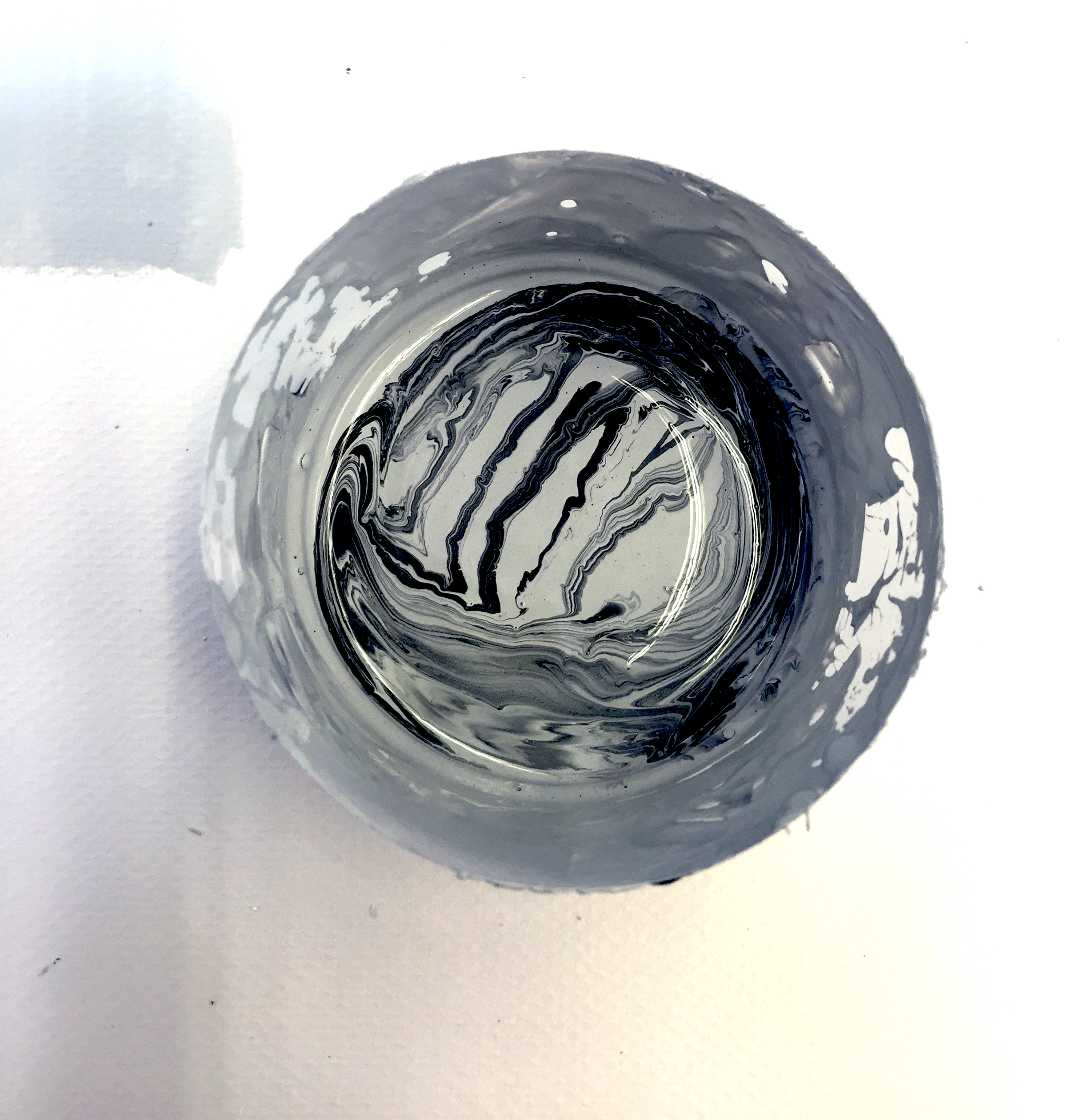

a study in monochrome
5) Thieves - The Beach
Here's the song I've been playing on repeat this week.